AI Summary
Introduction
Machine Learning and especially deep learning have had tremendous success in the last few years, primarily through the use of complex models and extended datasets. While the focus has been placed on improving models through ever-growing complexity, the recent shift towards a Data-centric AI has shown that a focus on data instead of model can have a more significant impact on performance.
To improve data, an important step is to understand its complexity and diversity. Unfortunately, with unstructured data such as pictures and text, direct analysis of the raw data is untractable.
The first solution is to use embeddings, which are usually a representation of the way some model understands the dataset and dimension reduction for visualization. But with Mapper [Singh et al., 2007], a tool from Topological Data Analysis we will describe in the second part, we can visualize with a simple graph the way our model interacts with the dataset. Mapper builds explicit links between the observations, making it much easier to detect labeling errors, outliers, hidden stratification (a subset of data where the model is underperforming), and overall dataset distribution.
Visualization of embeddings
Embeddings are usually defined as relatively low-dimensional vector representations of some unstructured data. They are relevant when in addition to dimension reduction, they map data points such that two points are closed in the embedding space if they have semantic similarity in the input space (for example, two pictures of a human face would be close to each other in the embeddings space but distant from a picture of a landscape).
Embeddings are usually computed by using the output of one hidden layer of a pre-trained Neural Network (most of the time, the penultimate layer), as it is generally admitted that such vectors match the requirement that we defined for “good” embeddings. Good embeddings capture high-level semantics of the input data while providing enough variability to represent its diversity.
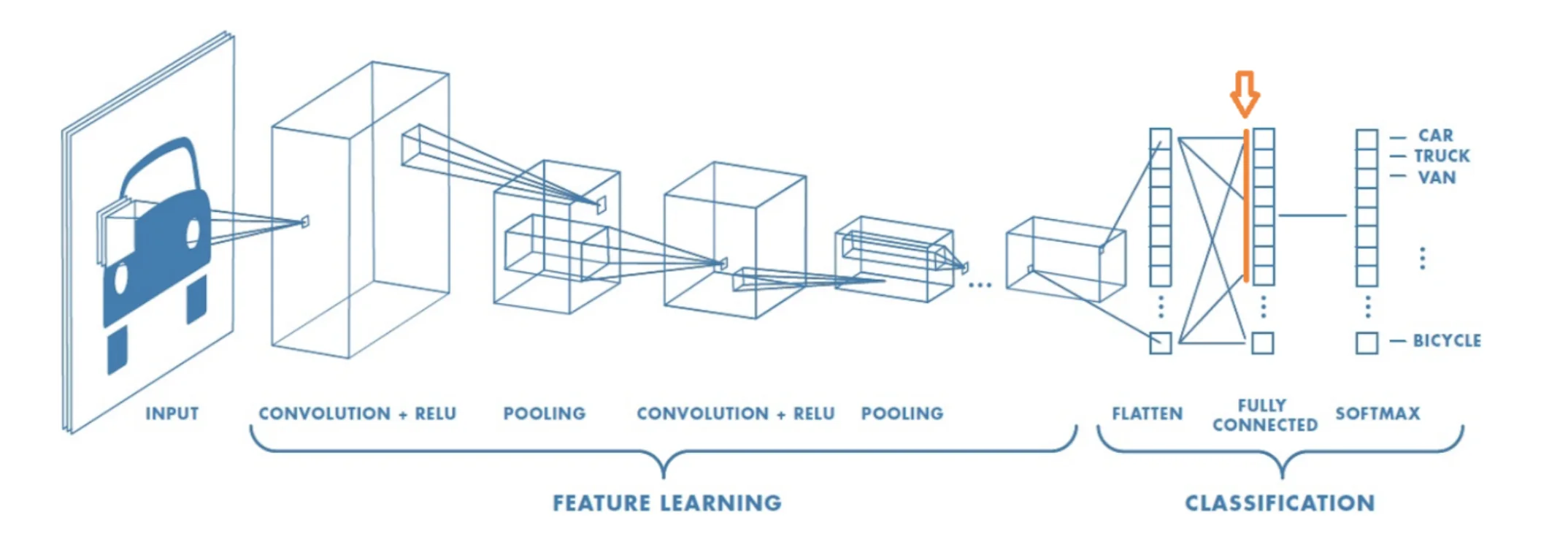
Figure 1: Example of a neural net. The embedding of an image is collected in the penultimate layer.
If embeddings are usually of lower dimensions than the original input space, they still reside in a space of a few hundreds/thousands of dimensions. It is thus impossible to visualize as such and some innovative, and powerful methods have been used to reduce the dimension while keeping as much information as possible, such as UMAP [McInnes et al.,2018].
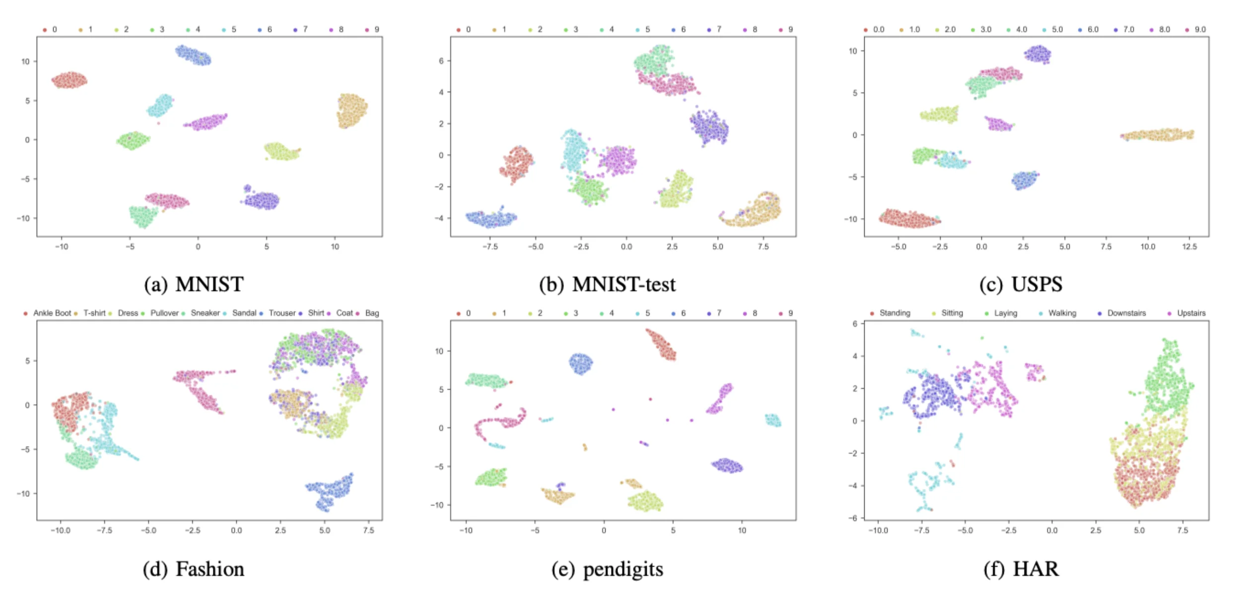
Figure 2: Example of embeddings after dimension reduction with UMAP for several datasets. Extracted from [McConville et al., 2019].
If those methods are useful for the visualization of the dataset, they don’t use the model's predictions. With Mapper, we can leverage those predictions to create a powerful and interactive representation of the dataset.
Topological Data Analysis and Mapper
Topological Data Analysis (TDA) is a field of mathematics that uses techniques from Topology to extract information from a set of points. This method has the benefit of being insensitive to the metric used and robust to noise. Mapper is a popular tool from TDA that creates a representation of the point cloud in the form of a graph where nodes are clusters of data:
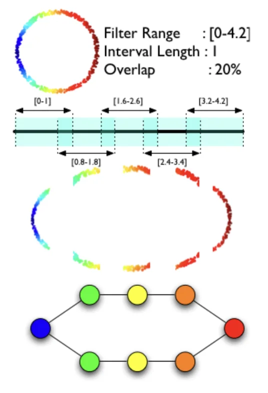
Figure 3: Mapper’s description. Extracted from [Singh et al., 2007].
Mapper uses a filter function that goes from the space of the point cloud (usually of high dimensions) to a space of small dimension (usually one or two).
- A cover (a cover of a set X is a collection of sets whose union includes X) is chosen on the codomain of the filter function to force a separation of the input data.
- For each set of the cover, Mapper performs clustering in the input space for data belonging to the preimage of this set under the filter function.
- If clusters from two sets share some data, an edge is created between the two nodes.
For example with data sampled from a noisy circle:
1. The chosen filter is the x coordinate (horizontal axis)
2. We choose a cover with 5 intervals of length 1 and 20% overlap.
3. Clustering on the preimage of each interval creates 7 nodes (1 for the first and last intervals, 2 for the others)
4. Every node shares points with 2 adjacent nodes, creating a circle graph representing our original dataset.
We can see in this example that Mapper has the ability to identify characteristic shapes of datasets (for example loops occurring when working with cyclic features) that traditional methods like clustering have difficulty detecting.
Mapper applied to dataset embeddings
The idea is to use the model’s predictions as a filter and a specific cover to produce a graph representation of the dataset which will be very useful to understand the model performance.
The cover we use is derived from an idea of Saul and Arenlt in their blog article “Machine Learning Explanations with Topological Data Analysis”. It starts by separating assets according to their label. Then we create 4.nb_classes + 1 sets into which assets are dispatches. The last set recovers all assets that the model is unsure about (probabilities of the asset belonging to any class < 55%). The other sets correspond to one cover for each predicted class with 4 intervals covering model confidence between 50% and 100% ( [50%-65%], [60%-75%], [70%-85%], [80%-100%] ).
For example:
- if the model predicts that asset A belongs to class i with a confidence of 95%, A will be assigned to set 4.i + 3 ,
- if the model predicts that asset B belongs to class j with a confidence of 72%, B will be assigned to set 4.j+1 and 4.j+2,
- if the model predicts that asset C belongs to class k with a confidence of 53%, C will be assigned to set 4.k and to the last set,
- if the model predicts that asset D belongs to class i with a confidence of 22%, D will only be assigned to the last set.
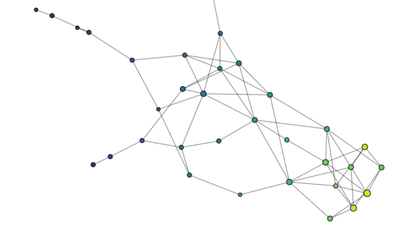
For one label category, the output should take the form of a “Neuron” with a large axon for assets where the model is correct and confident in its prediction and dendrites corresponding to assets where the model hesitates with another class.
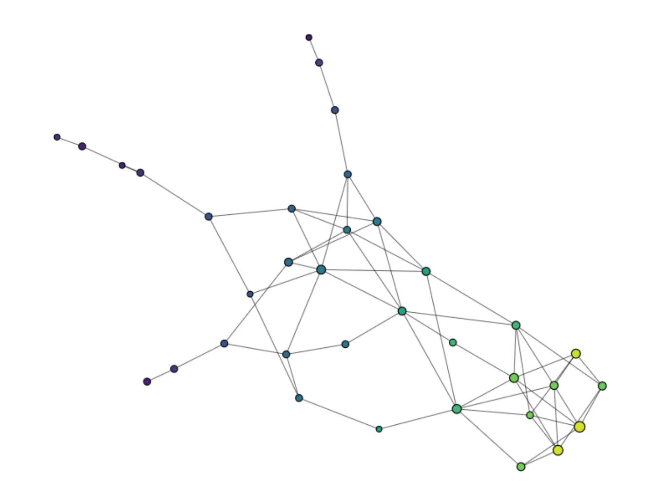
Figure 4: Mapper representation of one label category of the Fashion-MNIST dataset. Constructed with Kili AutoML and KeplerMapper
We use Gudhi’s implementation of Mapper to create the Graph and KeplerMapper [van Veen et al., 2019]to create a .html file with the visualization. The method is implemented in a branch of the AutoML repository of Kili Technology, and can be used to generate the representation with one line of code:
kiliautoml mapper \
    --api-key KILI_API_KEY \
    --project-id KILI_PROJECT_ID \
    --predictions-path PATH
Here's the end-to-end notebook to create a Mapper display with a dataset loaded to Kili.
Learn more!
Discover how training data can make or break your AI projects, and how to implement the Data Centric AI philosophy in your ML projects.
Example with the Fashion-MNIST dataset
For this example we will work with a subset of the Fashion-MNIST dataset with 13.200 assets randomly selected. The model used is an efficientnet_b0 trained with the AutoML library from Kili with 10.000 assets.
You'll find here an .html file with the dataset visualization with Mapper.
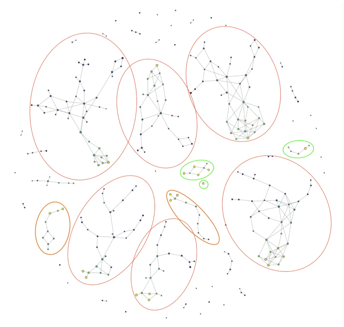
Figure 5: Mapper representation of a subset of the Fashion-MNIST dataset. Constructed with Kili AutoML and KeplerMapper
The size of a node reflects the number of assets inside (with a logarithmic scale, we circled every component with more than 15 assets).
The color of a node represents the probability (according to the model) that the asset belongs to its actual label (average for all assets belonging to the node). Yellow is for values close to 1, meaning the model is correct and has no difficulty identifying that the asset belongs to its class. Purple is for values close to 0, meaning that our model is having difficulties in classifying the asset and is probably making a false prediction.
We observe:
- 6 large components (circled in red), each representing one label category with almost all assets belonging to that category inside the components. We have large yellow nodes, meaning that for most assets, the model is correct, but also some thin branches with blue and purple nodes, each representing a confusion the model is making with another class.
Four classes are missing: “Bag”, “Trouser”, “Ankle Boot” and “Sandal”.
- 3 small components (in green) with assets belonging to classes “Bag” and “Trouser”. Here there are no branches inside the components and only nodes with colors going from yellow to green, meaning the model is performing very well in those classes. The “Trouser” category is the only one here with more than one significant component. This is due to the distinction the model is able to make between light and dark-colored trousers.
- 2 medium components in orange with assets belonging to “Ankle Boot” and “Sandal”. Those components have one side with large yellow nodes where a lot of assets are classified correctly and one side with small darker nodes where the model is confused between the correct category and the other one.
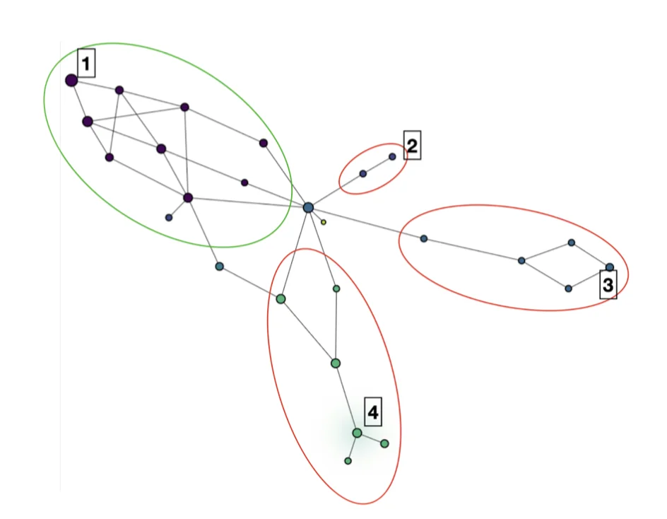
Figure 6: Mapper representation of category “T-shirt/Top” of the Fashion-MNIST dataset. Constructed with Kili AutoML and KeplerMapper
Let’s take a closer look at the large components with assets belonging to the class “T-shirt/Top”. This time, we colored each node according to the predicted class (purple = “T-shirt/Top”, lavender = “Pullover”, light blue = “Dress”, green = “Shirt”). We see that each branch regroups assets where the model is making a confusion between the right label and another one. At the tip of the branch, we have assets that the model is confident belong to the wrong class.
If we look inside nodes 1 to 4 (random sample from each node):
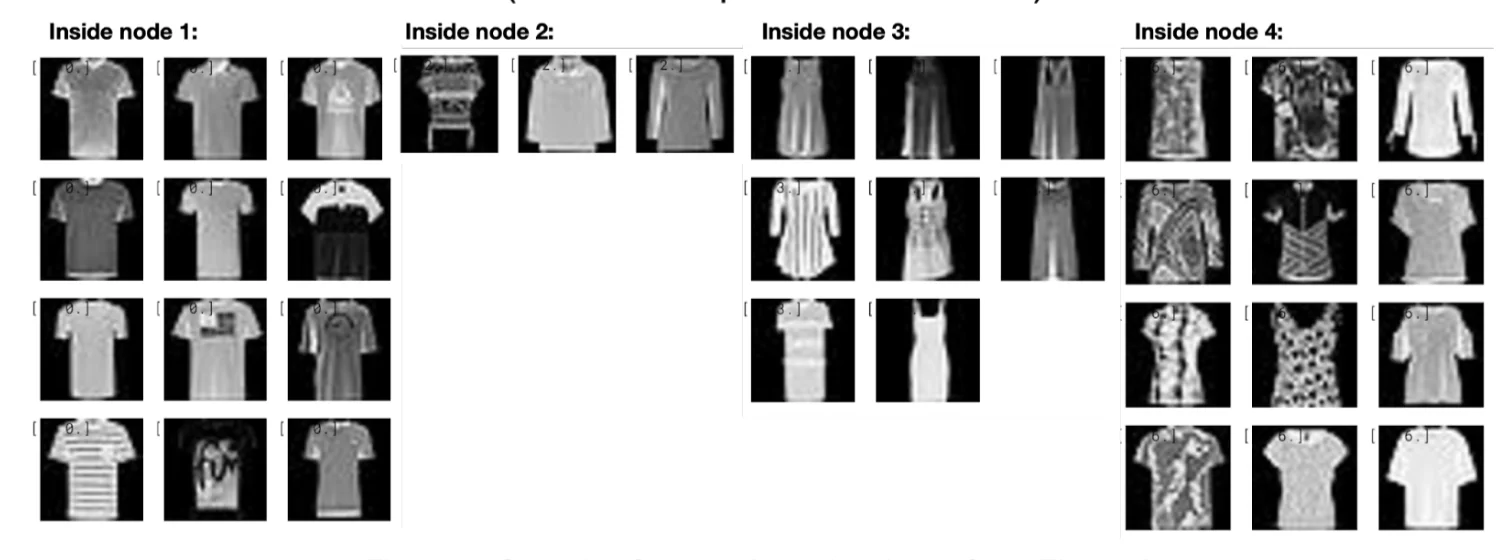
Figure 7: Sample of assets in nodes 1 to 4 from Figure 6
- In node 1, we have 967 assets the model is predicting correctly. Most of them have very short or even no sleeves and open collars.
- In node 2, we have 3 assets the model is predicting as “Pullover”. One looks like a poncho and the other ones have long sleeves and a closed collar. .
- In node 3, we have 8 assets the model is predicting as “Dress”. Only one has sleeves but they all appear to be very long.
- In node 4, we have 34 assets the model is predicting as “Shirts”. They present diverse shapes, some present a button or a zip line, and they all have complex patterns.
Looking at nodes 2 to 3, we can see that the quality of our dataset is not perfect. The definition of class “T-shirt/Top” is complex and some assets inside those nodes are difficult to classify even for humans.
From there, a data scientist could choose:
- to update the model (for example by using robust optimization or adding a correction layer);
- to modify the dataset (for example by adding more pictures of “T-shirt/Top” with long sleeves or complex pattern);
- or even to redefine the label categories (for example with a distinction between tops with long sleeves, short sleeves or no sleeves).
Conclusion
With Kili AutoML and Mapper, you can create a powerful and interactive dataset representation in conjunction with a model. The model’s performance throughout the dataset is easily visualized.
Data scientists and machine learning engineers can use this tool to understand the reasons why the model is failing. It can help to detect hidden stratification (a subset of data where the model underperforms), labeling errors, or a misconception of the label categories. Once revealed, these errors can be corrected to improve the model and/or the dataset. We believed that such a Human-in-the-Loop approach combined with a Data-Centric focus are the keys to successful and trustworthy AI.
References
Gurjeet Kaur Chatar Singh, Facundo Mémoli, and Gunnar E. Carlsson. Topological methods for the analysis of high dimensional data sets and 3d object recognition. 2007. URL http://dx.doi.org/10.2312/SPBG/SPBG07/091-100
Ryan McConville, Ra ́ul Santos-Rodr ́ıguez, Robert J. Piechocki, and Ian Craddock. N2D: (not too) deep clustering via clustering the local manifold of an autoencoded embedding. CoRR, abs/1908.05968, 2019. URL http://arxiv.org/abs/1908.05968.
Nathaniel Saul and Dustin L. Arendt. Machine learning explanations with topological data analysis. URL https://sauln.github.io/blog/tda_explanations/.
Leland McInnes, John Healy, and James Melville. Umap: Uniform manifold approximation and projection for dimension reduction. 2018. URL https://arxiv.org/abs/1802.03426.
Gudhi: Geometry Understanding in Higher Dimensions, URL https://gudhi.inria.fr/
Han Xiao, Kashif Rasul, and Roland Vollgraf. Fashion-mnist: a novel image dataset for bench-marking machine learning algorithms. CoRR, abs/1708.07747, 2017. URL http://arxiv.org/abs/1708.07747.
Hendrik Jacob van Veen, Nathaniel Saul, David Eargle, and Sam W. Mangham. Kepler mapper: A flexible python implementation of the mapper algorithm. Journal of Open Source Software. URL https://doi.org/10.21105/joss.01315.
Hendrik Jacob van Veen, Nathaniel Saul, David Eargle, and Sam W. Mangham. Kepler Mapper: A flexible Python implementation of the Mapper algorithm, October 2020. URL https://doi.org/10.5281/zenodo.4077395.

.png)
_logo%201.svg)


